


Analyzing Marketing Ads in the Wild
And why you should too.

By now we know how much I love to analyze marketing ads. If you don’t know, let me explain. As a Creative Director, one of the main, if not primary part of my job is to convey a certain message through the content I create regardless of what that may be. Whether it’s photo or video, if the brand has a specific message, it’s my job to make sure you as the consumer, are able to pick up on that message within the first 5-10 seconds of looking at it. When you’re shopping online or if you visit in-store, you’ll find a bunch of images advertising the products surrounding it. The purpose of these assets is to SELL; to get you as the consumer, to see it and think “omg that is so cool I need it right now.” The message should be clear and able to be understood quickly. The faster a consumer knows what you’re trying to sell, the faster they can buy. While my job is to deliver on these images, one of my part-time hobbies is to analyze what is already out there and break it down completely; from the lighting to the angles and color palette, there’s always something I would do differently and there’s always a way to grow my personal skillset and creative process. It’s more of a competitive landscape check if you will, to see what I’m up against, but it’s become a learning experience. Photos are not just photos anymore and advertisements are not just advertisements. So many brands underestimate the power of what good imagery can do for identity and sales, so it’s my job to show them why it matters. In my spare time, I go to any store my vibe is feeling that day, i.e. Sephora, Nordstrom, Bloomingdales etc, and peep the imagery on display. The photos you see in-store can tell you a lot about a brand if you know how to look at it, which brings us to today.
Types of Imagery You’'ll Find in Store
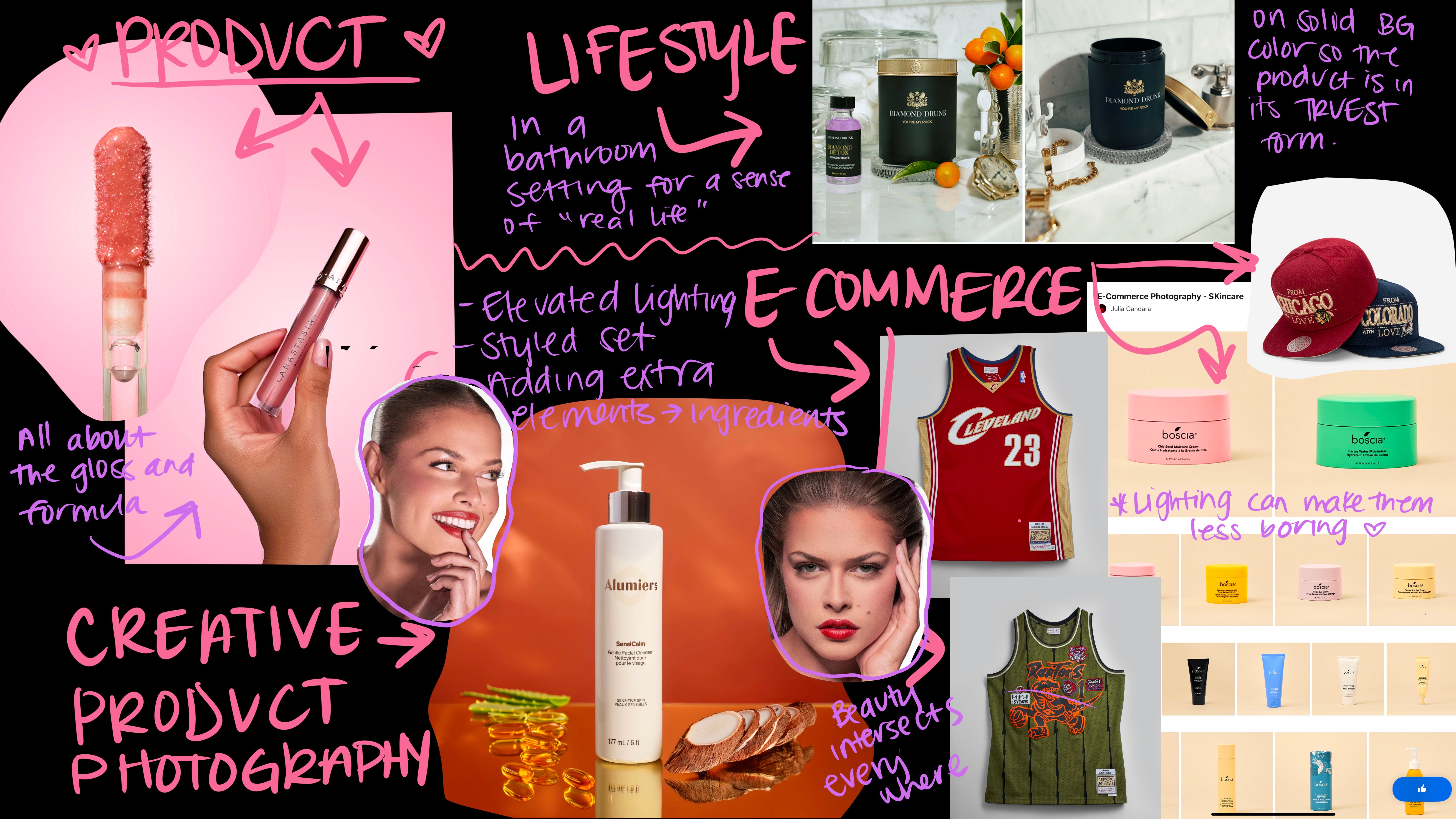
You know when you’re shopping online and you find something you really like but you need to see more pictures of it? There’s a reason for that; let me break it down for you. Whenever you’re shopping, whether that’s in-store or online, there are 5 primary types of photography you’ll find marketing those products: E-Commerce, Lifestyle, Product, Creative, Beauty (I thought about adding editorial but that really only applies to luxury as most commonly known and shopped brands are not spending editorial monies. We can think about editorial in spirit, but that’s for a later date lmao).
E-Commerce Photography: clear and isolated product photos, typically shot on solid white, grey or light shades so all of the product is shown in its truest form. Used mostly on shopping websites or catalogue style layouts. Consumer RELY on these pictures in order to know what a product looks like before they buy it. While there are other types of imagery that greatly impact sales, E-Commerce is arguably the higher yielding imagery type, which means if you have a business where you sell any sort of product or good, investing in your ecomm is always a smart idea. “bUt I cAn ShOoT iT oN mY pHoNe” - yea, it’s going to look like it too.
Lifestyle Photography: The most common images you’ll see on any website. These are images that depict the product/good in a “real life” setting, so you as the consumer can picture it in your own life or your own home. A bottle of skincare on the bathroom counter next to a plant or a pair of running shoes on a running trail; putting the product or person out in the real world, makes it more real to you. Without lifestyle content in your E-Commerce Carousel, you have a bunch of product photos on white that make you look like a fake business that no one has purchased from. It adds the humanity back into a catalogue style format.
Product Photography: While both e-comm and lifestyle imagery can definitely include product, product imagery is where the primary message is the product. It is less general than something being featured in a lifestyle setting or just photographed on white. True product photography leaves no question as to what or who the subject is. It is the difference between a photo of a beautiful model holding up the product, versus the product on a table front and center with the model blurred out in the background so the product doesn’t have anything else to compete with. These product images are typically used in key place holders, whether on websites or in-store displays, so the product should arguably be clear and defined so the consumer knows what to buy. I say arguably because there are those who strive to create “art” where the message might be a bit more abstract, or the photos are blurred and distressed. That is a creative style, definitely, but make no mistake.. At the end of the day, the goal is to sell whatever you are taking a photo of. If your blurry, vintage photo sells your product, then don’t change a thing. However, if the thing I am trying to buy is blurry, I probably won’t buy it.
Creative Photography: Before you try and come for me about my last sentence, I said what I said because the “art” is considered Creative Photography when it comes to marketing. Creative assets are supplementary to the evergreen content but is still needed for products or messages you really want to highlight. This is where you get really creative and bust out all the stops. These are typically shot in studio as a campaign to really help elevate your overall message/product in a way that tells a story. Brands need stories to survive; after all, they are entities; things with no technical heart, brain or experience has a human. If you run your marketing without stories, you more than likely don’t have much of a brand. You have a website and a shopify account with a bunch of e-comm photos and stock imagery. The creative content should showcase your product in a way that is much more elevated and purposeful. Feel free to get a bit more artsy here, but consumers should still know what they’re looking at, at the end of the day. If they aren’t sure, then you may have gone too far.
Beauty Photography: This is by far my favorite as I’m sure many of you know. When it comes to cosmetics and skincare, you’ll see primarily creative product photography and Beauty Photography. These images are up close and personal of a model wearing whatever product is being advertised. They are typically much more detailed than traditional photography, and can range from simple catalogue looks to high end editorial looks. Beauty campaigns are also highly edited; skin, hair, teeth, eyes, everything gets high end retouched. From the posing and angles to the direction their eyes are looking, every little thing can tell a story, especially in product displays and on websites.
Why Are There So Many Types?
What a phenomenal question, this I remembered from college. (shameless college plug because I absolutely highly recommend you go, as I have learned so much and definitely do attribute a lot of it to the experiences I had within those 4 years). Okay, so why are there so many types of imagery in marketing? Remember how I told you these images need to convey specific messages? They have a purpose. It’s called the Methods of Persuasion.
Methods of Persuasion
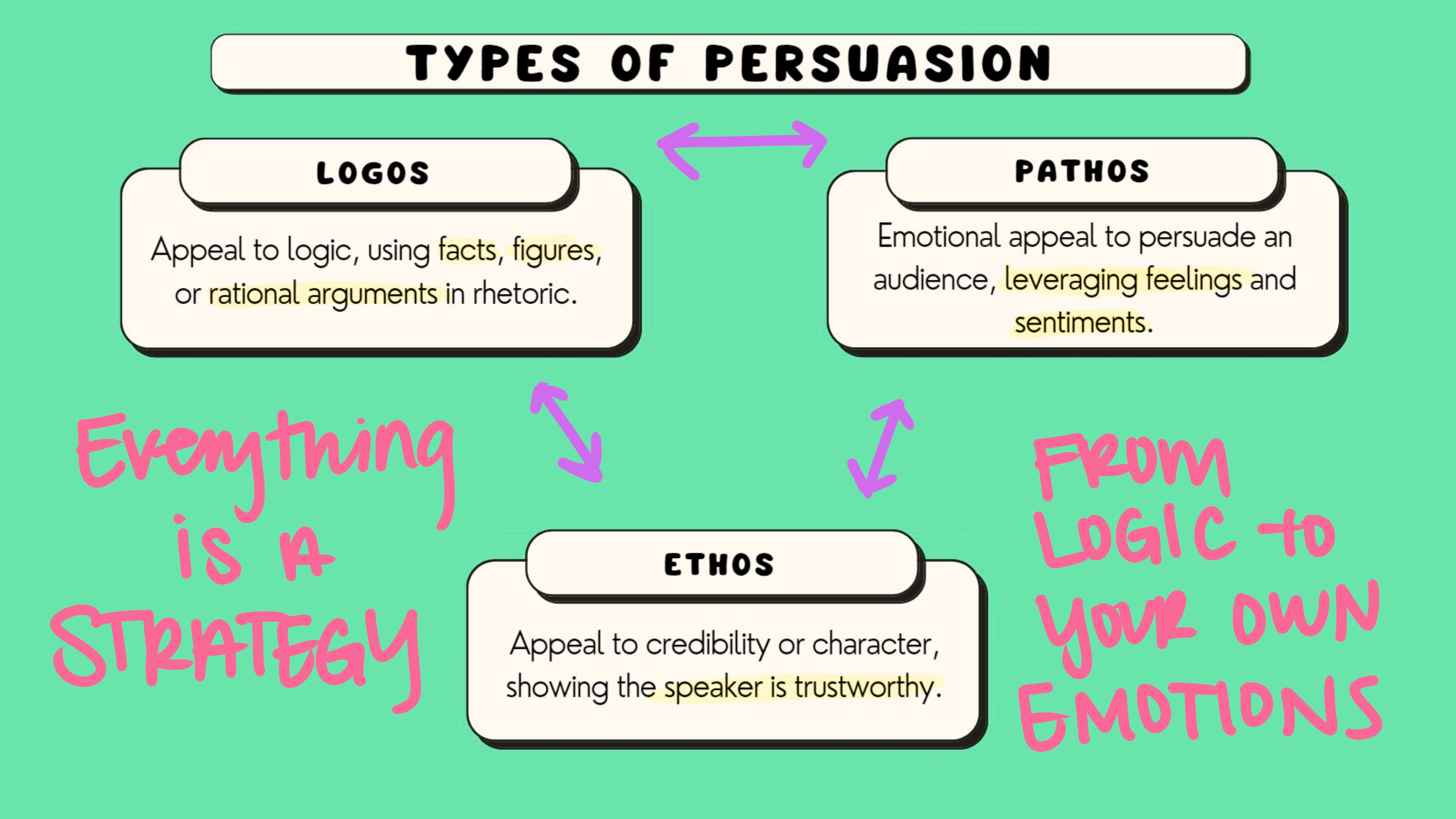
What I love about marketing is that there is always a reason as to why people move the way they do; why they decided to buy this or that. The Methods of Persuasion refers to the framework for understanding how people are persuading: Ethos, Pathos, Logos. It was created by Greek philosopher, Aristotle, and is used in advertising in order to successfully market to target audiences, especially in imagery, shoutout Dr. Kara, one of my old marketing professors from college.
Ethos: Credibility appeal. Appealing to ethos is a way to provide credibility to your product or brand, i.e. a brand using a celebrity to endorse a product, “it’s gotta be good if they use it”
Pathos: Emotional appeal. This is something that hits you right in the feels and appeals to your emotions. In marketing and advertisements, the emotional appeal is typically used as a way for the brand to get you to feel the way they want you to feel; whether that is sad, anger, rage or pity, appealing to pathos is used to invoke a certain emotion. In imagery, it can be a touching series of photos of a mom putting lipstick on her daughter for the first time and seeing her off for a school dance. The brand mom used back at her first school dance is the same brand daughter uses. I just wrote a commercial that will probably make most of us with mommy issues bawl out loud during the superbowl. And just like that, lipstick sales skyrocket.
Logos: Appealing to logic. Depending on the message, you may need to come with receipts for whatever it is you are trying to say. This is called appealing to logic; showcasing data, statistics, certain knowledges and such to persuade your audience to believe your point. Take sustainability for example. Remember that mom with the lipstick? Maybe that brand is also sustainable. A brand can’t just claim sustanability, they need to prove that with certain certifications and restrictions etc. “Lasts up to 12 hours,” “double the staying power,” “safe for sensitive skin” etc.
What Does This All Mean?
Content is a business and businesses always advertise themselves. Most people will go into their local Sephora, see the images on the new Charlotte Tilbury display and may not thing anything of it, but I think it’s really important we do. If you can understand the image, you can begin to understand the business behind it.
Does it Look Like They Cared?
You can tell a lot about a business by the effort they put into they’re content marketing. I stopped by my local Ulta today and Ms. Charlotte Tilbury has the most noticeable display by far. From their signature pink, gold and brown tones throughout the display, but also in the level of photography. In every Charlotte Tilbury image, the effort is clear. This was a production. You see it in the lighting, in the hair and makeup, in the overall production value of the imagery. They spent money on this and it shows, which tells you they probably spent money on their product formulation as well and everything that went into it. When you see a brand put effort behind certain aspects of their marketing, it really speaks to who they are as a brand; and Ms. Tilbury does not skimp on her photoshoots or marketing campaigns.
Not every display has the ability or resources to take up an entire wall at Ulta or Sephora, and not every brand has the means to invest the necessary amount into their photo and video production. But for the ones who do, you may recognize some familiar faces.
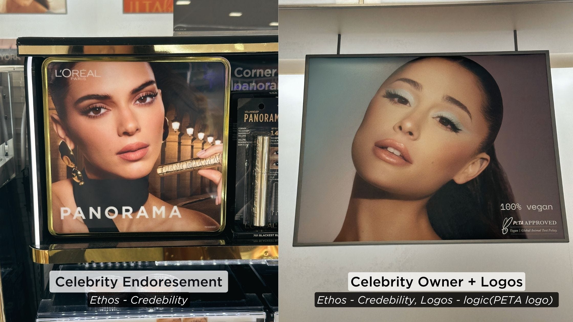
Above are images of two marketing placements for well known beauty brands L’Oreal, and R.E.M Beauty by Ariana Grande. At first, the images may just look like celebrity portraits or screenshots from a recent event they attended. In reality, they are marketing banners, heading their respective displays in my local Ulta Beauty. L’Oreal has been a powerhouse, dominating beauty counters since the early 1900’s, so it’s no surprise they have ambassador, Kendall Jenner, as the face of their new Panoramic Mascara. I actually almost didn’t see the mascara there as it’s all the way to the edge of the frame, in front of a background of a similar color. The message? Kendal Jenner uses L’Oreal, aka appealing to Ethos for credibility. To the right we have Ariana Grande for her new beauty brand, R.E.M. Beauty. In the bottom right of her image are the logos for being PETA Approved and we love to see it. As for the image, in the immediate I noticed it was, at first, a general image of Ariana Grande. You do notice her eyeshadow, but it’s interesting that there was no logo of the brand but there was the cruelty free logo. Similar to L’Oreal, it is a celebrity endorsement doing the communication. Ariana Grande herself is the endorsement as it is her own beauty brand. Ariana appeals to Logos coming with the PETA logo, however most mainstream brands are PETA approved and 100% vegan & cruelty free, so it may be a way to seem a bit more mainstream than they actually are.
Why Do I Care About This?
As a Creative Director, you almost always have to consider the future and the past before you plan out the present. Not only are you responsible for the direction of the creative, the team and overall production, but also the post production and overall content strategy from start to finish most of the time. Your job does not stop once the images are done. An experienced Creative Director understands that the delivery of the content and how it is digested is equally as importance as the content itself. The CD is involved in every step from start to finish, either directing or collaborating in order to ensure the final content hits all the expected marks, which means every decision is a strategy. Every color, every pose, model, and text overlay is calculated for the sole purpose driven by monetary gain; that can range from investing budget into an elevated production for a new campaign in order to increase awareness, or completely cutting production budget and relying on stock imagery to help cut business costs. Here are some things to consider next time you decide to analyze marketing ads out in the wild:
Photo Quality: Did they put the proper amount of effort into their imagery? Was this well thought out and executed? The effort put into their imagery can sometimes be a direct reflection of the effort they put into their actual product.
Brand Identity: Does this image accurately reflect who the brand is or do they seem boring, one note, or unsure as to who they are? A brand without a clear direction may not be one with a longterm lifespan.
Brand Representation: Does the brand’s imagery accurately reflect their missions and values, along with sharing yours as well? i.e. are their images diverse, do they showcase product truthfully, is their imagery an accurate representation of everything they claim to believe in? Any brand can say they have a mission to change lives and enhance everyones makeup routine; so you can say that but how will you show me that in your content. And do I agree with whatever I see?
It’s always good to challenge your brain and try to understand all these multiple perspectives within these different images from all these different brands. Next time you are out and about and see some giant photos in front of the display windows, break them down in your head. Look at the lighting, look at the clarity of the message, the framing of the product, look at everything that is supposed to make this great. Not only have I grown as a Creative Director by doing this little forms of photo analysis, but really making the effort to understand these types of images helps me understand potentially where the business is at financially when it comes to their creative department, and that says a lot about the effort as brand is willing to put in.

Bird Friendly Coffee!!
I recently went to the San Diego Zoo, one of my favorite places in the world, and we had this guy, Brian, as our Bus Driver for the bus tour. You could tell he was probably a brilliant mind and new a lot about a lot. As we drove through the tropical forest surrounding us, he dropped some info I will literally never forget in my life, Bird Friendly Coffee. When it comes to coffee cultivation, 75% of the world's coffee is farmed with practices that leave no place for birds, or worse, actively destroy forest habitat. Also known as Shade Grown Coffee, Bird Friendly Coffee is grown in trees and greenery of all types, covered by forest shade while supporting biodiversity that creates a quality habitat for birds and other wildlife. This certification protects birds and habitats while being 100% organic certified — no harmful pesticides — so they are better for the people and the planet; not to mention the assist they provide with Global Warming.
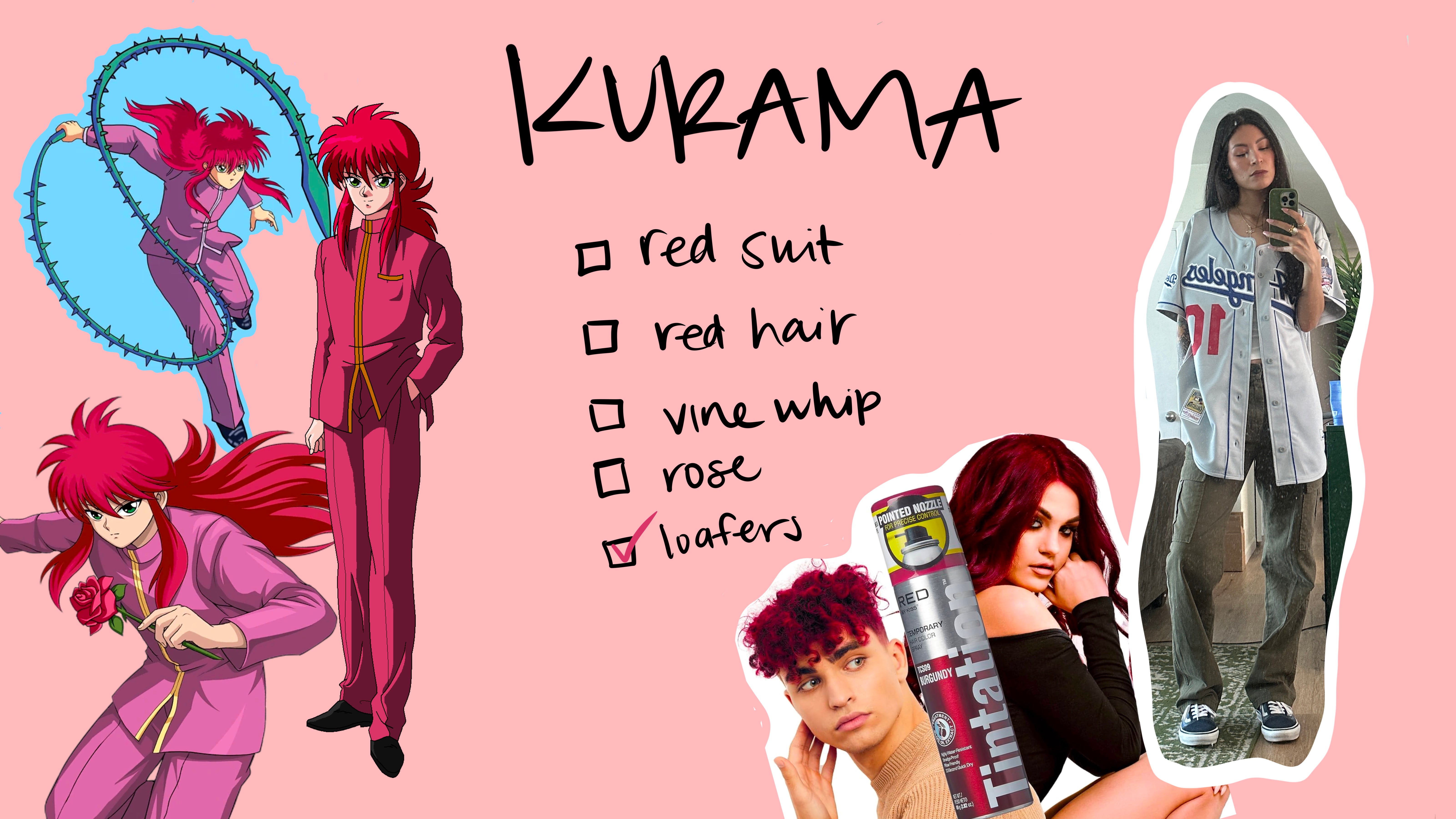
Planning my fit for ANIME CON 2024!!! This will be my first time ever to Anime Con and I am so excited to dress up. I have decided to go as Kurama, my favorite character from Yuyu Hakusho (is my capricorn showing?). He is so balanced and collected, just a sense of control I wish I had. So the outfit planning starts NOW! If you or someone you know can help me out with this, PLEASE reach out. Im going to do my best but I know the suit is going to be hard to find.
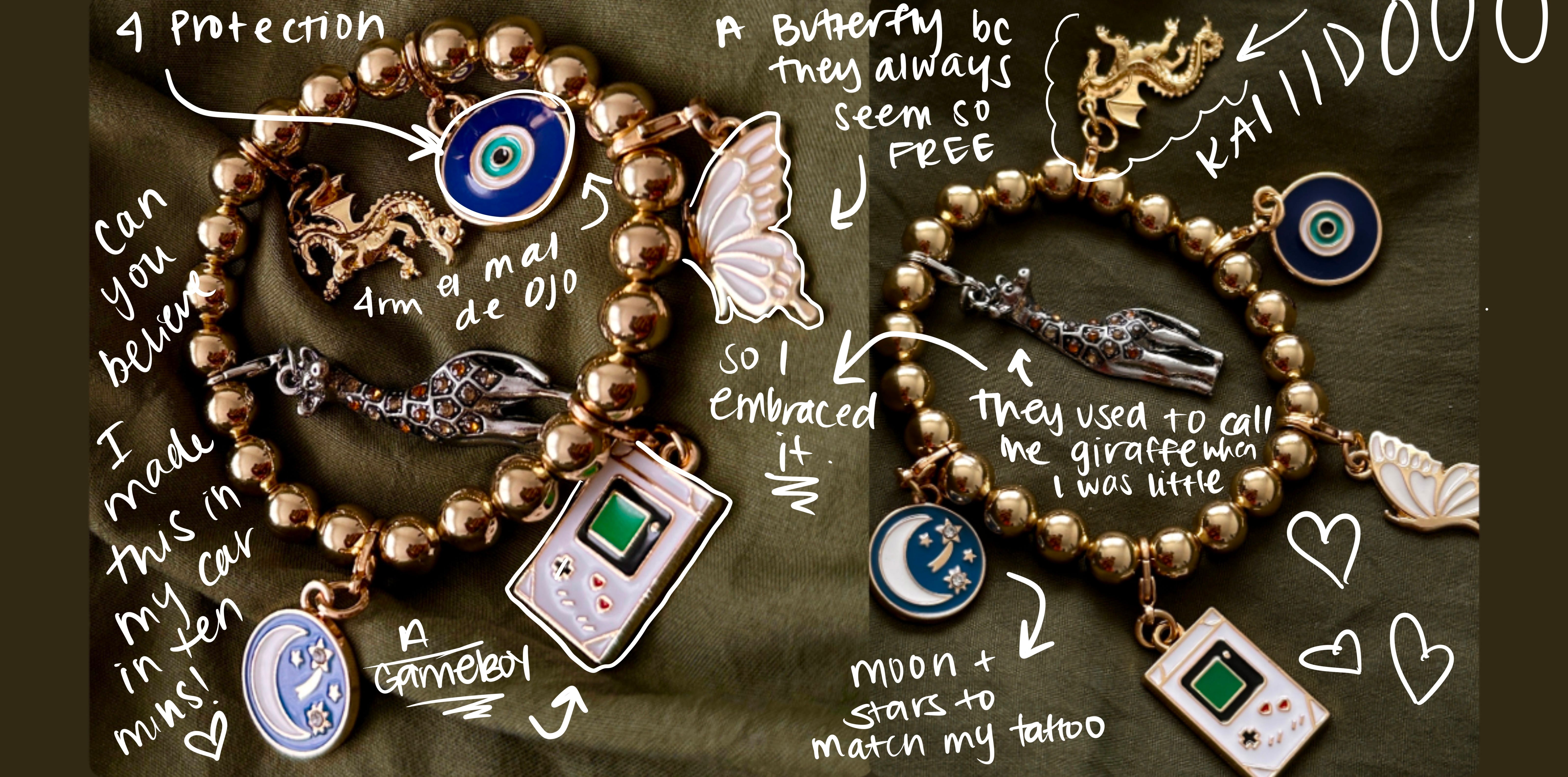
Making my own charm bracelets!! I’ve only made one, But Still! The other day I was running errands and stopped by Michaels looking for some photoshoot props. I stumbled upon the jewelry section but I knew I didn’t want to make it a whole thing. I ended up finding these clip on charms and this cute stretchy gold bead bracelet and had a mini arts and crafts session in the whip for a good 10 minutes. Who needs therapy when you can make your own jewelry?
Bumping this song while I get ready in the mornings. It wakes me up and makes me feel like im somewhere else for that hour drinking my cafecito. That song is….. Suave by Luis Miguel.
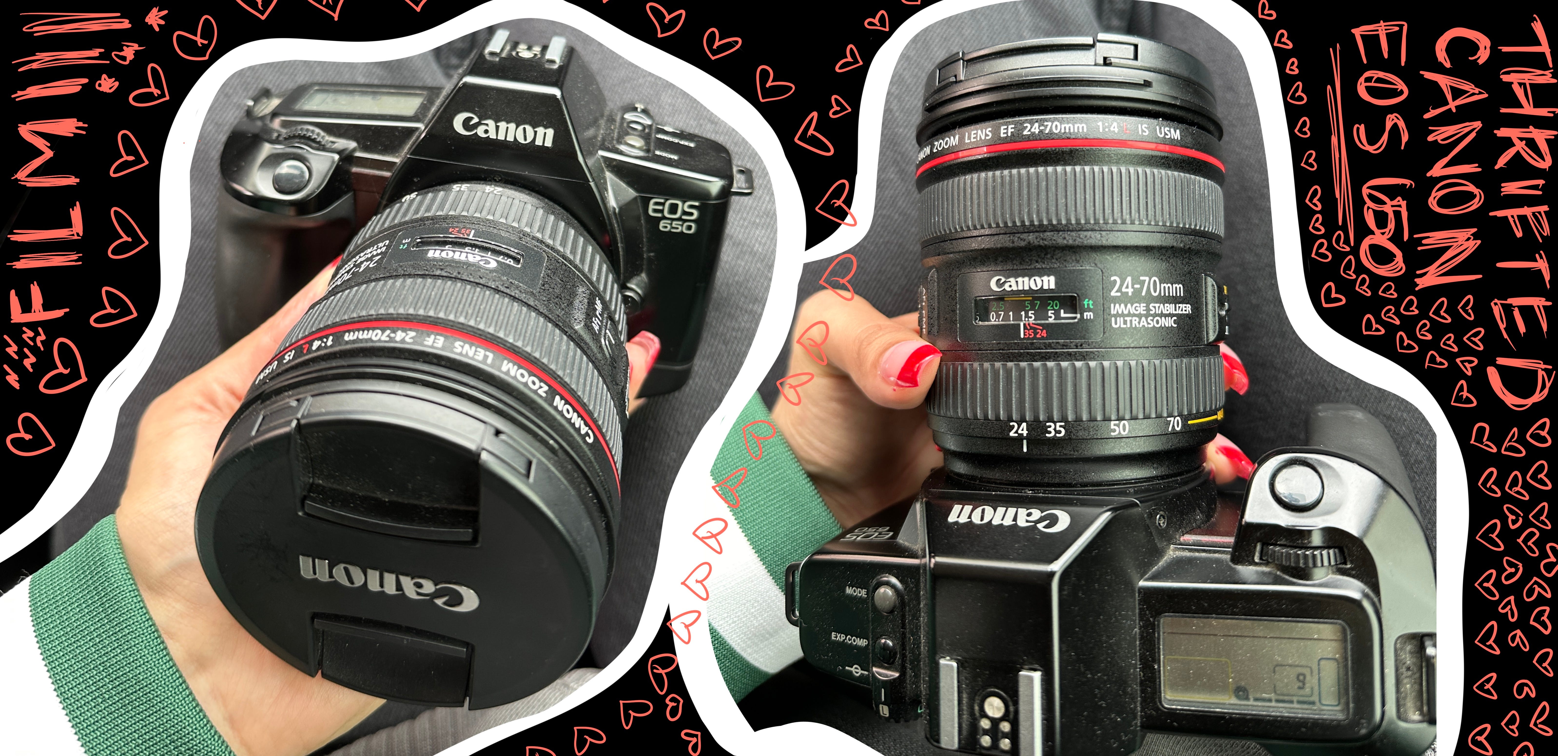
My Thrifted $15 Canon 650 Film Camera - lens not included lmao. I am an avid thrifter, especially when it comes to tech. The majority of my household tech and gear is thrifted if you can believe that; form cameras to lenses to video games and consoles. Most people end up buying cameras that they don’t know how to use, and in this case, their ignorance was my bliss. She needed a bit of cleaning but once i added some film and slapped a lense on her, she came through for me and still does. I bring her with me on trips or places I know I will want some memorable film shots.
Thanks for hanging out this week. I hope it didn’t feel too much like a college course lmao but we should always be aware of what they are trying to sell us on before we buy. The smarter we are about it, the more we can impact the industry in a better way. Below are some links to all my favorites, plus places that give ya’ll a discount on some of those things too. Next week I will be breaking down the most asked question I get, “What is a Creative Director?” and “How do I become one?” See you then, amigas!
KLOVEYOUBYEEEEEE<3
✩ LINKS 4 YOUUU ✩
✭ tiktok
✭ BeHance
✭ Linktree
✭ LTK
✭ Depop